The Hidden Treasures of Interface Design: Elevating User Experience to New Heights
In the ever-evolving digital landscape, interface design is the crucial bridge between users and technology, shaping how individuals interact with digital platforms. While the surface-level aesthetics of interfaces often garner attention, beneath lies a treasure trove of subtle elements and strategies that profoundly impact user experience. These hidden treasures, ranging from micro-interactions to Gestalt principles, are key to creating interfaces that captivate, guide, and delight users on their digital journeys.
Microinteractions: Enhancing Engagement Through Subtle Gestures
Microinteractions, although often overlooked, are the unsung heroes of interface design. These are the small, nuanced interactions that occur within digital interfaces, such as the subtle animation of a button upon hover or the satisfying sound of a notification being dismissed. While seemingly inconsequential, micro-interactions are vital in enhancing user engagement and satisfaction. They provide feedback, communicate status changes, and inject personality into the user experience, creating moments of delight and fostering a deeper connection between users and interfaces.

Consider the example of a shopping app that employs micro interactions to simulate the tactile experience of flipping through a catalog. As users swipe through product images, subtle animations, and transitions mimic the sensation of turning pages, creating a seamless and immersive browsing experience that encourages further exploration and interaction. These micro-interactions enhance usability and elevate the overall enjoyment of the shopping experience, leaving users with a lasting impression of the brand.
Gestalt Principles: Crafting Coherence and Clarity in Design
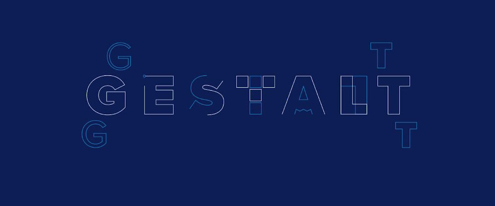
Gestalt principles, a set of psychological principles that govern how humans perceive and interpret visual information, are at the core of interface design. These principles, including proximity, similarity, continuity, and closure, provide a framework for organizing and arranging design elements to create cohesive and visually appealing interfaces. By leveraging Gestalt principles, designers can ensure that interfaces are intuitive, coherent, and easy to navigate, enhancing user comprehension and satisfaction.
For example, consider the design of a weather app that utilizes the principle of similarity to group-related information, such as temperature, humidity, and wind speed, under a single visual hierarchy. By presenting these elements in a cohesive and visually consistent manner, users can quickly scan and interpret the information without feeling overwhelmed or confused. Similarly, closure can be employed to create visually engaging interface elements, such as icons or logos, that invite users to mentally complete the missing parts, fostering a sense of familiarity and recognition.
About
Welcome to our dynamic blog, a hub of creativity!
Delve into mesmerizing photographs, innovative design trends, and exciting event coverage. Join us as we celebrate the fusion of artistry and imagination, inspiring your own creative endeavors along the way.


